Powerstart
OMG National (at the time of this project) has 11 individual solutions that customers can sign up for to increase their online presence. However, with this many solutions, a phone call with a sales representative can feel a little overwhelming for customers.
How can we help a potential client easily pinpoint their needs without blasting them with a sales pitch?
We create Powerstart!

Powerstart is a page that potential clients can walk through a series of form fills and questions, at their own pace, with simple prompts to finally reach a specific product.
They don’t have to be on the phone with someone and feel pressured to buy anything!
My first iteration was a full page design:

With a single page design, The final product that was chosen by the engine would update right on the same page, with all the relevant information under it.
I thought this was good design at first…until users were not signing up! We also couldn’t get any information about potential customers that were interested.
It’s OK if you don’t sign up, but if you are potentially interested, it would be great to get your contact info for follow up!
So how do we get the potential client to finish the path, as well as get their information without having to scroll to the bottom?

We make each step a page
To start off, we get the client information, and keep the user informed about which step they’re at. Each of these major steps gets its own page.
To me, the most important page is the first page, the contact page! The juiciest page in my opinion…..we can get our reps to call them back!

I switch from dark mode to light mode (because OMG National has a much brighter scheme).
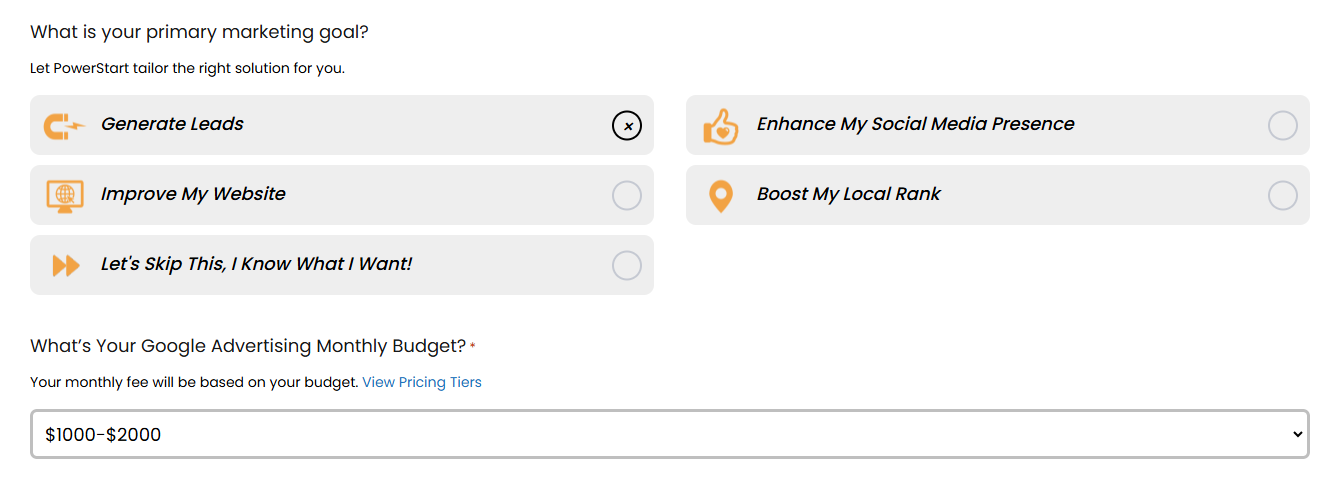
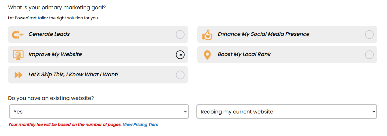
Next are the radio buttons! These are supposed to be simple goals that will start the product specification. Each one gets their own cool little icon.

Each radio button get's its own drop-downs and custom form fills:

The Recommended Solution!
Once the potential customer satisfies all of the prerequisites, a final product is recommended.
The hierarchy of information:
The Product Name
Tagline
Pricing
Potential Uses
Product Features
Cell Mockup
VIdeo and More Info
Let’s Do It!

Each solution gets it’s own color scheme, iconography, and cell mockup!

The Full Page:
Here is the final page from top to bottom with the recommended product!
I had a great time designing this project, it was simple and unique but powerful!
